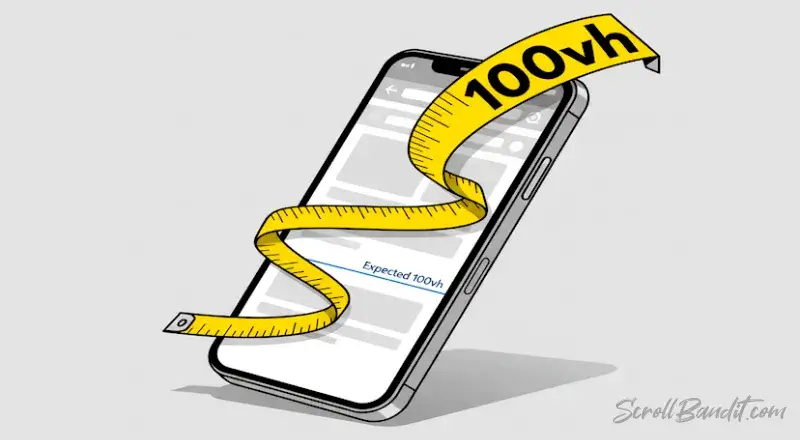
That “full-screen” hero you built? Not on mobile. Toolbars shift, heights lie, and half your banner disappears. Here’s how to make it actually fill the screen – everywhere – without a single line of JavaScript.
The problem
100vh lies on mobile. Browser toolbars eat pixels, and your “full-height” hero gets chopped.
The fix
Use the new viewport units svh, lvh, and dvh, plus safe-area insets. No JavaScript, no guessing.
.hero {
  min-height: 100svh;
  display: grid;
  place-items: center;
  padding: 2rem;
  padding-top: calc(2rem + env(safe-area-inset-top));
  padding-bottom: calc(2rem + env(safe-area-inset-bottom));
}

@supports (height: 100dvh) {
  .hero {
    min-height: 100dvh;
  }
}

@supports not (height: 100svh) {
  .hero {
    min-height: 100vh;
  }
}
Why it works
svh avoids toolbar lies, dvh adapts live, and safe-area insets dodge notches. 100vh stays as fallback for older browsers.